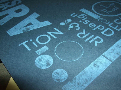
For the crash printing assignment, I wanted to typeset a cover for my portfolio. I used a couple different fonts and different sizes to make an interesting and dynamic image using type. I found it really hard to set type backwards and try to figure out what it would look like after it had been printed, but it actually turned out readable! Unfortunately, some of the letters were not type high, so they did not print as smoothly or as completely as the others, but this just added to the handmade, typeset aesthetic. I hope to use these prints as a cover for a portfolio of my work!
Tuesday, May 13, 2008
POLYMER PLATE: final prints
Here are my final prints of my polymer plate designs! I can't believe they turned out so well, just how I wanted them to! The registration on most of them was almost right on. The transparent inks also worked out, I was really pleased with the final prints. The image above shows the actual prints from the press and the polymer plates on the right hand side. Some of the prints were really interesting because the pink did not print fully, so when the green was printed on top, it created a gradient of the pink, green and overlapped color (the dull purple). Printing these was so fun, and seeing the final prints actually turn out how I wanted them to was amazing! Printing these was a great way to learn about the printing process, because sometimes its difficult for me to relate my digital designs to how they will be printed so they can turn out as close to the digital file as possible. A lot of work goes in to turning a digital design into a printed piece!!!
WEBSITE: Updated for GD1
My website has been updated with all of my GD1 projects and descriptions!!! I still need to add to the other categories, but the GD1 section is complete. I tried to keep each page unified with one another and allow for easy navigation with "prev" and "next" buttons, and a home button on each page. Each page has images of the projects and one of the images on each page displays the project description and explanation when the mouse rolls over it. I had to keep the image sizes small so it would fit on the University of Minnesota webspace that we are provided, because I have many more images to add!!!
Monday, April 28, 2008
POLYMER PLATE
For the last assignment we were given a word that ended with MADE. My word was HOMEMADE, so I thought of homemade food, like cookies and pies. My design was based on the retro-style aesthetic to portray my word homemade. It resembles the signs from the 50's while emphasizing the homemade component with the fresh pie. The top image shows both of my plates and the colors I want to use for each plate. When the plates are printed it should turn out like the bottom image, with the purple color being the mix of the pink and green. I hope they turn out!!!
Wednesday, April 9, 2008
SERIES personal critique
These are the final versions of my three campaign pieces. The top one is an interior bus ad, the second is a newspaper ad and the last one is a direct mail piece. The direct mail piece folds into a square. The top one is the outside of the mailer and the two white panels fold in to make the image. The bottom one is the inside image when you open the mailer. I created all of the images for the pieces in Adobe Illustrator and each piece is designed using one color and black. The figures and thought bubbles are in black and white so they really stick out from the colored backgrounds and create a visual hierarchy. I added statistics to each piece to develop more of a directed focus and credibility. All of the pieces turned out well and I think they really get the message across in an interesting way. They were designed to reach college students/young adults and get the serious message across through fun illustrations that don't talk down or try to persuade through depressing imagery like many other alcohol abuse ads. To develop this campaign, I created a unified appearance with repeated images that appear in each piece (the dots in the background and figures, the Drink Smart logo, the lamp and the thought/speech bubbles). Overall, I really like all of the pieces, and I'm happy to see that all of my hard work payed off!!!
Monday, April 7, 2008
GREENWAY personal critique
Here is my final design for the cover of the Greenway Coalition mailer. The actual size is 8.5 x 5.5 inches. I illustrated the flowers from reference photographs of native Minnesota plants. I think the flowers are more integrated into the photograph in comparison to my rough draft and the line quality of the flowers is working a lot better here, too. Overall, I think that the bright colors and integration of the people in the photograph, to show the community involvement aspect, makes the design interesting and eye-catching. There are still some things that I would like to change. The design of the top could be improved and I think a different photograph would also help the design.
Tuesday, March 25, 2008
GREENWAY in process
Our assignment is to design a promotional piece for the Midtown Greenway Coalition, which is a non-profit organization that develops and maintains gardens and nature along the Greenway path. The promotional piece must inform about the Greenway and explain how to get involved. Because the Coalition is non-profit, they do not want a formal "corporate" feel in the promotional piece. It must also be easily reproduced. This is the ROUGH draft of the cover. I wanted to create a bright cover that would grab someone's attention amongst a pile of white, bland envelopes in the mail. This mailer is going to be an 8.5 x 11 piece of paper printed on both sides, folded in half and sealed with a sticker. The flowers are "drawn" in to represent how the community can make the Greenway more beautiful. It contrasts with the photographic quality of the image in the background to distinguish the present (planting and gardening) from the future (the flowers that will grow from the help of volunteers). Still a rough draft, just to get the concept on paper.
Subscribe to:
Posts (Atom)