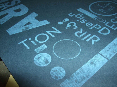
For the crash printing assignment, I wanted to typeset a cover for my portfolio. I used a couple different fonts and different sizes to make an interesting and dynamic image using type. I found it really hard to set type backwards and try to figure out what it would look like after it had been printed, but it actually turned out readable! Unfortunately, some of the letters were not type high, so they did not print as smoothly or as completely as the others, but this just added to the handmade, typeset aesthetic. I hope to use these prints as a cover for a portfolio of my work!


2 comments:
Your printing looks like it turned out great. The use of dark backgrounds creates interesting contrast with the ink. The print is very cohesive, with a distinct style in your type choices (I like the tilted design letters) and variations on shapes, such as circles and rectangles.
Lisa, it's a great idea to use these as portfolio covers! I'm glad that you were able to do something useful that will serve you in the future!
Post a Comment